

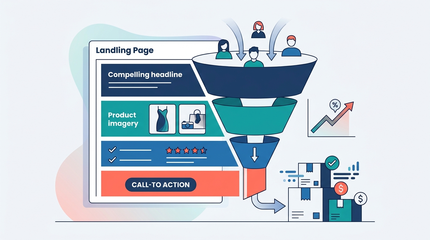
A high-converting landing page is not merely a digital brochure; it is a precision-engineered funnel designed to guide a visitor toward a single, specific action. According to recent industry benchmarks, the average conversion rate across all industries sits at approximately 2.35%, with the top 25% of sites achieving rates above 5.26%. This data highlights a critical gap between average performance and elite results. For businesses relying on paid traffic, the difference between a 2% and a 5% conversion rate is often the difference between profitability and loss. At Design Digital, we approach every project with the understanding that data drives strategy, while creative execution drives attention. This guide dissects the architectural and psychological components required to build pages that do not just attract visitors, but convert them into measurable revenue. (Design Digital About Design)
The Power of the Headline and Hero Section
The hero section is the first and most critical real estate on your landing page. It must communicate value instantly. A visitor decides whether to stay or leave in less than eight seconds. Therefore, the headline must be clear, concise, and directly aligned with the ad or search query that brought them there. This alignment is known as message match. If a user clicks an ad for "SEO Services for Real Estate," the landing page headline must explicitly mention real estate SEO, not just general digital marketing. (Design Digital Blog Design)
SEO is the process of optimizing online content to rank higher in search engine results pages. Without message match, even the most beautiful design fails because the user feels misled. The subheadline should then expand on the primary benefit, addressing the "how" and "why" of the offer. At Design Digital, we ensure that every campaign we run is both insight-driven and impossible to ignore. This means the headline is not just catchy; it is strategically positioned to capture the user's immediate intent.
Furthermore, the visual component of the hero section must support the text. High-quality imagery or video that demonstrates the product in use or the result achieved creates an emotional connection. Stock photos of people shaking hands often reduce trust. Authentic visuals increase engagement by showing real-world application. This balance of data and creative is what accelerates growth for our clients.
Visual Hierarchy and User Flow
Visual hierarchy dictates the order in which users perceive information. It guides the eye from the most important element to the least. This is achieved through size, color, contrast, and spacing. The primary call-to-action button should be the most visually dominant element on the page. It should use a contrasting color that stands out against the background and surrounding text.
Lead generation is the process of attracting and converting strangers and prospects into someone who has indicated interest in your company's product or service. To facilitate this, the user flow must be logical and linear. Avoid clutter. Every element on the page should serve a purpose. If an element does not contribute to the conversion goal, it should be removed. This principle is known as the principle of parsimony in design.
White space is not empty space; it is a powerful design tool. It gives the eye a place to rest and emphasizes the content that matters. Pages with adequate white space are perceived as more professional and trustworthy. By simplifying the layout, we reduce cognitive load, making it easier for the user to make a decision. This strategic simplification is a core tenet of our digital strategy services.
Strategic Social Proof and Trust Signals
Social proof is the psychological phenomenon where people assume the actions of others in an attempt to reflect correct behavior for a given situation. In the context of landing pages, this translates to testimonials, case studies, client logos, and trust badges. These elements reduce perceived risk and build credibility.
According to research by Nielsen, 92% of consumers trust recommendations from friends and family over advertising. While you cannot control friend recommendations, you can control how you present third-party validation. Displaying logos of well-known clients, such as those we have worked with at Design Digital, signals competence. Specificity in testimonials is crucial. A testimonial that states "This service increased our revenue by 30%" is far more persuasive than "Great service!".
Trust badges, such as security certifications or industry awards, further reassure users that their data and money are safe. These signals are particularly important for e-commerce and high-ticket service providers. They act as subconscious green lights, allowing the user to proceed with confidence. We find the balance of data and creative to accelerate growth, and social proof is the data-backed bridge between interest and action.
Call-to-Action (CTA) Optimization
The call-to-action is the directive that tells the user what to do next. It must be action-oriented and benefit-driven. Instead of "Submit," use "Get My Free Audit." This shifts the focus from the effort required by the user to the value they receive. The CTA should be repeated throughout the page, not just at the bottom. This ensures that users who are ready to convert at any point can do so without scrolling.
Video content is a powerful tool for explaining complex offers. A short video in the hero section or near the CTA can increase conversion rates by up to 80%. It allows you to demonstrate value quickly and build a personal connection. However, the video must be optimized for speed and mobile viewing. Auto-play with sound off is often the best practice to avoid annoying users while still capturing attention.
The color of the CTA button matters, but context is more important. The button should contrast with the background but fit within the overall brand palette. Testing different colors is essential, as the "best" color depends on the specific design environment. A/B testing is the process of comparing two versions of a web page to see which one performs better. This data-driven approach eliminates guesswork and optimizes for maximum ROI.
Minimizing Form Friction
Forms are the primary mechanism for lead capture, but they are also the biggest source of friction. Every additional field reduces conversion rates. The rule of thumb is to ask only for the information you absolutely need. If you can qualify a lead through other means, such as a quiz or a dropdown selection, use that instead of a long form.
Marketing automation allows businesses to streamline, automate, and measure marketing tasks and workflows to increase operational efficiency and grow revenue faster. Integrating forms with marketing automation tools ensures that leads are instantly routed to the correct salesperson or nurtured via email sequences. This immediacy is critical. Leads contacted within five minutes of submission are nine times more likely to become qualified opportunities.
Clear labeling and placeholder text in form fields guide users on what to enter. Error messages should be helpful and specific, telling the user exactly how to fix the problem. A broken form is a broken promise. Ensuring that forms are robust and user-friendly is a fundamental aspect of our website design and development process.
Mobile Performance and Speed
Mobile traffic now accounts for more than half of all web traffic globally. A landing page that is not mobile-optimized will fail to convert the majority of its audience. Mobile optimization involves responsive design, where the layout adjusts seamlessly to different screen sizes. Buttons must be large enough to tap easily, and text must be legible without zooming.
Page speed is a critical ranking factor for search engines and a key determinant of user experience. Slow-loading pages lead to high bounce rates. Google recommends that pages load in under three seconds. Optimizing images, leveraging browser caching, and minimizing code are essential technical steps to achieve this. At Design Digital, we prioritize technical excellence to ensure that creative efforts are not undermined by poor performance.
Local SEO is the practice of optimizing your online presence to attract more business from relevant local searches. For businesses with a physical presence, ensuring that mobile users can easily find location information and contact details is vital. This includes integrating Google Maps and click-to-call functionality. These small details can significantly impact conversion rates for local service providers.
Key Takeaways
- Message Match is Mandatory: The headline must directly reflect the user's search intent or ad copy to prevent bounce.
- Social Proof Builds Trust: Specific testimonials and client logos reduce perceived risk and increase credibility.
- CTA Clarity Drives Action: Benefit-driven, high-contrast buttons repeated throughout the page maximize conversion opportunities.
- Form Friction Kills Leads: Minimizing the number of form fields increases the likelihood of submission.
- Mobile Optimization is Non-Negotiable: Responsive design and fast load times are essential for capturing mobile traffic.
- Data Guides Creative: A/B testing and analytics inform design decisions, ensuring continuous improvement.
- Visual Hierarchy Guides the Eye: Strategic use of size, color, and white space directs user attention to key elements.
Frequently Asked Questions
What is the ideal length for a landing page?
The ideal length depends on the complexity of the offer. Simple offers may require only a short page, while high-ticket items often benefit from long-form copy that educates the user. The key is to include all necessary information to overcome objections without unnecessary fluff.
How many calls to action should a landing page have?
A high-converting landing page should have one primary call to action. Secondary links, such as to a blog or about page, should be removed to prevent distraction. The goal is to guide the user toward a single conversion event.
Why is page speed important for conversions?
Page speed directly impacts user experience and search engine rankings. Slow pages lead to higher bounce rates, meaning users leave before the page fully loads. Faster pages keep users engaged and are more likely to convert.
What is the role of A/B testing in landing page optimization?
A/B testing allows you to compare two versions of a page to determine which performs better. It provides data-driven insights into what works, eliminating guesswork and enabling continuous improvement of conversion rates.
How can I build trust on a landing page?
Trust is built through social proof, such as testimonials and client logos, as well as trust badges and clear privacy policies. Authenticity and transparency are key to establishing credibility with potential customers.
What is the difference between a landing page and a homepage?
A homepage is designed for exploration and brand awareness, with multiple navigation options. A landing page is designed for a specific conversion goal, with a focused message and a single call to action.
How does mobile optimization affect SEO?
Google uses mobile-first indexing, meaning it primarily uses the mobile version of a site for ranking and indexing. A mobile-friendly site is essential for maintaining search visibility and attracting mobile traffic.
Start Your Conversion Journey
Building a high-converting landing page requires a blend of strategic insight, creative excellence, and technical precision. It is not a one-time task but an ongoing process of testing, learning, and optimizing. At Design Digital, we specialize in helping businesses achieve these results through our comprehensive suite of services. From paid advertising to SEO and content creation, we provide the tools and expertise needed to drive growth.
Ready to transform your digital presence? Contact us today to discuss your project. Visit our contact page to request an audit or schedule a consultation. Let us help you bring your brand into focus and maximize your ROI.