

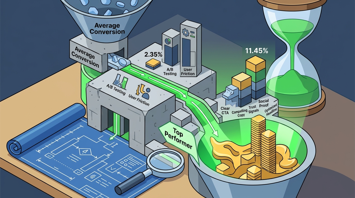
Data shows that the average landing page conversion rate across all industries sits at approximately 2.35%. However, the top 25% of performers consistently achieve rates above 11.45%. This massive disparity is not accidental. It is the result of deliberate architectural choices that align user intent with clear, compelling action. For businesses relying on paid traffic, a landing page is not merely a web page. It is a precision instrument designed to convert curiosity into revenue. At Design Digital, we find the balance of data and creative to accelerate growth by ensuring every element serves a specific psychological or functional purpose.
Headline Clarity and Value Proposition
The headline is the single most critical element of any high-converting landing page. It must communicate the primary benefit within three seconds of load. Users decide whether to stay or leave based on this initial signal. A vague headline results in immediate bounce rates that destroy campaign ROI.
High-converting headlines focus on outcomes, not features. Instead of stating "We offer SEO services," a superior headline states "Increase Organic Traffic by 30% in 90 Days." This specificity builds immediate trust. The subheadline should then expand on the mechanism, explaining how the promise is delivered. This combination of bold claim and logical proof creates a compelling narrative hook.
Clarity trumps creativity in this context. If a visitor has to guess what you do, you have already lost them. The value proposition must be unique to your brand. It should answer the question, "Why should I choose you over the competitor?" This is where your specific expertise becomes your greatest asset. For instance, our approach to Search optimization is built on data-driven insights that prioritize sustainable growth over short-term tricks.
Visual Hierarchy and Design
Visual hierarchy guides the user's eye through the page in a predetermined path. This path should lead inevitably to the call to action. Without a clear visual structure, users feel overwhelmed and disoriented. Good design is invisible. It facilitates understanding without demanding attention to itself.
Effective visual hierarchy relies on contrast, size, and spacing. The primary call to action button should be the most visually dominant element on the page. It must contrast sharply with the background color. Secondary elements, such as testimonials or feature lists, should be visually subordinate. This ensures that the user's attention is not diverted before they reach the conversion point.
Whitespace is a powerful tool in this hierarchy. It prevents cognitive overload by giving each element room to breathe. Crowded pages signal desperation and lack of professionalism. Ample whitespace signals confidence and clarity. This principle is central to our Website Design philosophy, where we ensure that every pixel serves a strategic purpose. We bring your brand into focus by eliminating visual noise and highlighting what matters most to your audience.
Strategic Social Proof Integration
Social proof is the psychological phenomenon where people assume the actions of others in an attempt to reflect correct behavior. On a landing page, it mitigates risk. Visitors are skeptical of claims made by the brand itself. They trust the experiences of peers.
Effective social proof includes client logos, specific case study results, and authentic testimonials. Generic praise like "Great service" is weak. Specific metrics like "Increased leads by 40%" are powerful. The specificity provides tangible evidence of value. It transforms abstract promises into concrete realities.
Our work with industry leaders demonstrates the power of targeted social proof. For example, we helped Cleopatra’s Bling, an Australian handmade jewellery brand, amplify their brand presence. By showcasing their unique craftsmanship and customer loyalty, we helped them convert browsers into buyers. Similarly, our partnership with Dion Lee, a fashion powerhouse, highlights our ability to handle high-stakes, design-forward campaigns. These examples illustrate how tailored strategies drive measurable results.
Form Optimization and Friction Reduction
Forms are the primary barrier to conversion. Every additional field increases friction and reduces the likelihood of submission. The goal is to collect only the information absolutely necessary for the next step in the sales cycle. If you need a phone number, ask for it. If you need a budget range, ask for it. If you do not need it, do not ask.
Long forms signal a long sales process. Short forms signal a low-commitment, easy next step. For lead generation, a balance must be struck. You need enough data to qualify the lead, but not so much that you deter submission. A/B testing form length is essential to finding this sweet spot.
Our expertise in Lead Generation focuses on minimizing drop-off rates. We analyze user behavior to identify where form abandonment occurs. By streamlining the input process, we increase the volume of qualified leads. This approach is critical for industries like Real Estate, where speed and ease of contact are paramount for capturing buyer interest.
Mobile Performance and Speed
Mobile traffic now accounts for more than half of all web visits. A landing page that performs poorly on mobile is a lost opportunity. Google's Core Web Vitals have made page speed a direct ranking factor. Slow pages frustrate users and hurt search visibility.
Mobile optimization is not just about responsive design. It is about touch targets, load times, and content prioritization. Buttons must be large enough for fingers. Text must be legible without zooming. Images must be compressed to load quickly on cellular networks. These technical details directly impact conversion rates.
Our Social Media campaigns often drive traffic directly to mobile devices. We ensure that the landing page experience is seamless across all screen sizes. This includes optimizing for vertical scrolling and thumb-friendly navigation. A fast, responsive page builds trust and encourages engagement. A slow, clunky page drives users away instantly.
Strategic CTA Placement
The Call to Action (CTA) is the destination of the entire page. It must be clear, compelling, and repeated strategically. A single CTA at the bottom is insufficient. Users may scroll away before reaching it. Multiple CTAs at key decision points keep the conversion path open.
CTA copy should use action-oriented language. "Get Started" or "Download Now" is more effective than "Submit." The verb should indicate the immediate benefit. The color should contrast with the background. The placement should follow the natural reading pattern of the user.
We also specialize in Marketing Automation to nurture leads who are not ready to convert immediately. However, the initial landing page must still drive a clear action. Whether it is a demo request or a newsletter signup, the CTA must be unambiguous. This clarity reduces cognitive load and increases the likelihood of conversion.
Key Takeaways
- Headline Impact: The headline must communicate a specific, measurable benefit within three seconds to prevent bounce.
- Visual Flow: Use contrast and whitespace to guide the eye directly to the primary call to action.
- Specific Proof: Use data-driven testimonials and recognizable client logos to mitigate perceived risk.
- Form Friction: Reduce form fields to the absolute minimum to maximize submission rates.
- Mobile First: Optimize for speed and touch interaction, as mobile traffic dominates modern web usage.
- Repeated CTAs: Place clear, action-oriented calls to action at multiple points along the scroll path.
- Data-Driven Design: Continuously A/B test elements to refine performance based on actual user behavior.
Frequently Asked Questions
What is the ideal length for a high-converting landing page?
There is no fixed length. The page should be as long as necessary to build trust and address objections, but as short as possible to maintain attention. Long-form pages work for complex products. Short-form pages work for simple offers. Testing determines the optimal length for your specific audience.
How many calls to action should a landing page have?
Focus on one primary call to action. Secondary links to other pages should be minimized or removed to prevent distraction. The goal is to guide the user toward a single conversion event without competing options.
Why is mobile optimization critical for landing pages?
Mobile users have different behaviors and expectations. They require faster load times and larger touch targets. If a page is not mobile-friendly, users will leave immediately. This results in wasted ad spend and lost leads.
What is the role of social proof in conversion?
Social proof validates the brand's claims through the experiences of others. It reduces uncertainty and builds trust. Without it, visitors must rely solely on the brand's word, which is often viewed with skepticism.
How does page speed affect conversion rates?
Slower pages increase bounce rates and decrease conversions. Each second of delay can significantly reduce the likelihood of a user completing a form. Speed is a fundamental component of user experience and SEO performance.
What is the difference between a landing page and a homepage?
A homepage is designed for exploration and brand building. It has multiple navigation options and diverse content. A landing page is designed for a single conversion goal. It removes navigation and distractions to focus the user on one action.
How often should I update my landing page?
Regular updates based on performance data are essential. Refresh headlines, images, and testimonials to keep the content relevant. A/B test new variations to continuously improve conversion rates over time.
Partner With Design Digital
Building a high-converting landing page requires more than just good design. It demands a strategic blend of psychology, data analysis, and technical precision. At Design Digital, we specialize in creating digital experiences that drive real business results. Our team of strategists, creative storytellers, and digital specialists work together to ensure your brand stands out in a crowded market.
Whether you need help with Digital Strategy, Video Content, or comprehensive Performance Marketing, we have the expertise to elevate your online presence. We find the balance of data and creative to accelerate growth for businesses across Australia and beyond.
Ready to transform your landing pages into revenue-generating assets? Contact Design Digital today to request an audit or schedule a consultation. Let us help you bring your brand into focus and achieve your growth objectives.